Blog
06 September, 2014
Ulrike Felsing - Dynamic Identities in Cultural and Public Contexts
Last week's posts about Karl Gerstner reminded me of this book. Dynamic
Identities in Cultural and Public Contexts (2010) is less of a design book, and
more of an academic research paper on dynamic logo design, in which the author
categorizes the different qualities of computational and generative identities.
I see a clear line to Karl Gerstner's work on modular design systems, and many
of his design products could have been featured in this book. Although the book
has many real-world design examples, I find the quality of them a bit lacking.
This could be because the field of generative design often leans more towards
trends and technical ambitions than actual good design. I show some of that work
in my lecture on
dynamic logos (although that
link mostly has notes for myself).

One of the more interesting logos in the book is the visual identity for Walker
Art Center in Minneapolis. I had the chance to see it in person during last
year's Eyeo Festival, and it's quite interesting.
The logo is built around the custom Walker typeface created for the center in
1995, and a custom piece of software that generates these word collages. Every
character in the alphabet is mapped to a word (d is design, e is
exhibitions, etc), and a new visual can quickly be generated by pressing a few
keys on a keyboard. The horizontal structure of the identity is also perfect for
leading visitors through the hallways of the building.
In a field where critical thinking is often neglected ("Hey look, I splattered
a canvas with an algorithm!"), I welcome this book with open arms.
03 September, 2014
Karl Gerstner - Designing Programmes
How would you react if I handed you a blank canvas and said "make a beautiful
drawing"? What if I instead said "make a beautiful pattern using only straight
lines"? The more experienced I get, the more I realize that constraints are a
central part of any design process, and Karl Gerstner's Designing Programmes
is one of the central books about this subject.
The book was released in 1964, but describes the kind of algorithmic design
process that is most relevant to designers from the computer generation.
It (the book) deals with a specific method of approaching creative design,
namely, systematically creeping up on a task rather than hoping for
inspiration from the higher regions. The key word is programming. (p. 8)
Gerstner's idea of a design program is a rule set or system defined by the
designer that can help shape all aesthetic decisions for a particular design
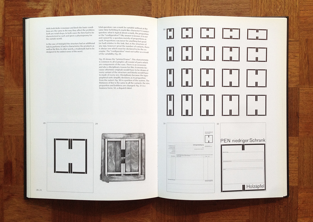
product. An example would be the following picture, where the logo for Holzäpfel
functions as both a grid system, a font, and a symbol for the company. The
design program is the basic geometry of the logo, which dynamically changes to
fit different design products.
Designing Programmes describes many applications for this design approach:
rule-based color selection, architecture as a program, and generative literature
(only to name a few). It's especially interesting to me how he describes a
programmatic approach to typefaces almost 15 years before Donald Knuth started
development of Metafont. If you're interested in this, I encourage you to read
through
my lecture on the subject.
I personally believe that Gerstner describes a design process that contemporary
designers barely are starting to understand, and only a handful of design
agencies have actually implemented
(Sagmeister & Walsh would be one). I think
there's a world of interesting ideas to explore if you apply Gerstner's ideas
towards designing in software, and I've personally started to poke at it with my
Printing Code class.
01 September, 2014
Karl Gerstner - The Forms of Color
In my lectures and
talks, I
often speak about the Swiss Style, a term used to describe a new approach to
graphic design that came from Switzerland in the 1960’s. One of the leading
figures in this movement was Karl Gerstner, who's book The Forms of Color
(1986) I recently bought.
Gerstner is an exciting author for anyone interested in algorithmic design
systems. Even though most of his work was done before the computer age, his work
concentrates on describing an almost algorithmic approach to design, inspired by
the teachings of the Bauhaus (Le Corbusier, Kandinsky, Albers, Itten, etc).
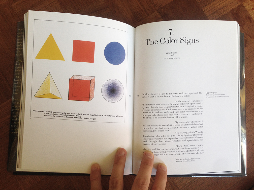
As shown in the picture below, Gerstner believes that color and color perception
should be learned by applying basic geometry to the color wheel. A very basic
example would be to overlay a triangle on the color wheel, creating a triadic
color scheme. By changing the angles of the triangle, you'll generate different
triadic color schemes based on the same formula.
This is how
I introduce the concept of color manipulation
to my students, as it's an approachable way of thinking about color in code. I
often think of Gerstner's goal as creating a vocabulary for design that breaks
the idea of the designer as an artist. The central idea of this is his Design
Programme, which I'll talk about in my next post.
31 August, 2014
Paul Rand - From Lascaux to Brooklyn
From Lascaux to Brooklyn was published in 1996, the year Paul Rand passed
away. Here's a short snippet from the jacket description:
In this lively and visually arresting book, Rand awakens readers to the
lessons of the cave paintings of Lascaux – that art is an intuitive,
autonomous, and timeless activity – and he shows how this is conveyed in works
of art [...] all of which are aestheticially pleasing no matter what their
era, place, purpose, style or genre.
The format of the book is like most of his other books: Short texts with lots of
examples of his own work.
I enjoy Rand's work because it balances a very freehand and artistic process
with a more systematic and functional design approach. He found freedom within
his own constraints in a way that very few designers has managed to do, and even
though his own work has a very specific style, this book – with its thoughts on
design principles as a foundation for all art forms – can be an inspiration to
anyone looking to apply a system to their own artistic process.
28 August, 2014
Paul Rand - Design, Form, and Chaos
Design, Form, and Chaos was one of Paul Rand's later books, published three
years before his death in 1996. The book focuses on seven of his most famous
logo designs (NeXT, IBM, IDEO, etc), and is especially interesting because
the original design portfolios – the pamphlets delivered to the clients – are
printed unedited along with the logo examples.
The IBM logo presentation shows the logo before and after Rand's redesign, as
he explains how the stripes were inspired by the horizontal lines sometimes
printed on legal documents to discourage counterfeiting.
I especially enjoy the presentation about the NeXT logo, where Rand presents
the precursors to the final logo, and explain why they didn't fulfill the design
goal. Seeing the logo come to life through a number of design steps is a nice
peek behind the curtain of his own design process, as well as a great reference
to any junior designer.
The story about the design of the NeXT logo is well-known, but it's a good
one: Steve Jobs
apparently asked
Rand to "come up with a few options" for a logo, whereafter Rand replied:
No. I will solve your problem for you. And you will pay me. And you don’t have
to use the solution. If you want options, go talk to other people. But I’ll
solve your problem for you the best way I know how. And you use it or not.
That’s up to you. You’re the client. But you pay me."
Rand later said that Jobs' first words after seeing the NeXT logo were "can I
hug you?. I own the first edition hardcover from 1993.